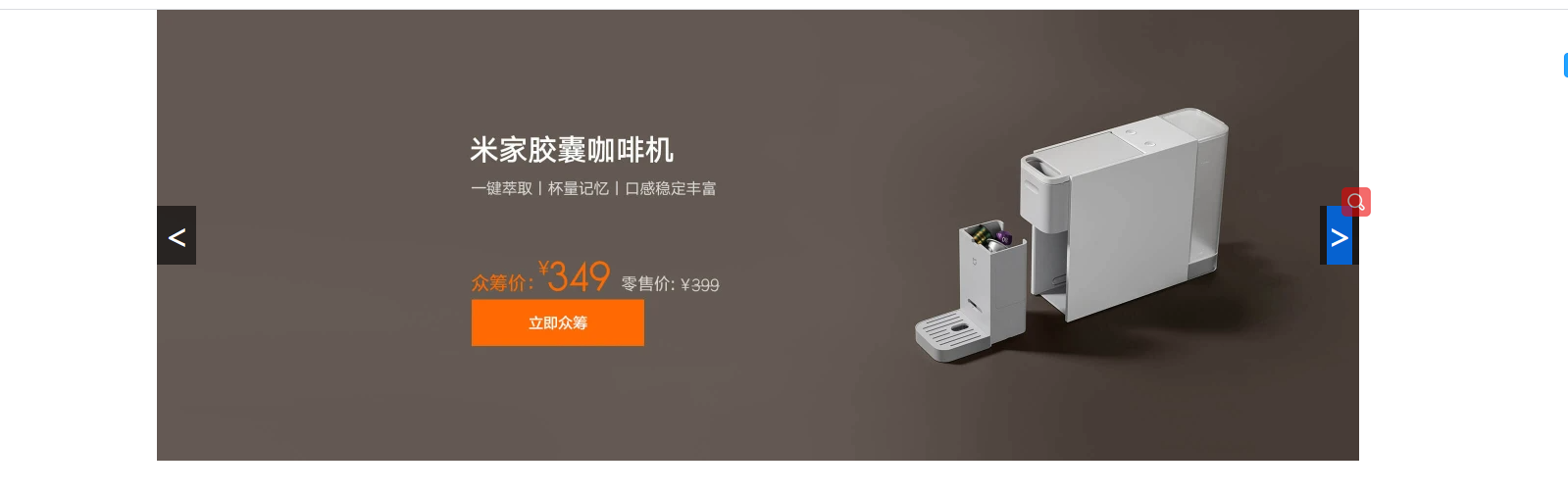
动态轮播图 小米样式
1
2
3
4
5
6
7
8
9
10
11
12
13
14
15
16
17
18
19
20
21
22
23
24
25
26
27
28
29
30
31
32
33
34
35
36
37
38
39
40
41
42
43
44
45
46
47
48
49
50
51
52
53
54
55
56
57
58
59
60
61
62
63
64
65
66
67
68
69
70
71
72
73
74
75
76
77
78
79
80
81
82
83
84
85
86
87
88
89
90
91
92
93
94
95
96
97
98
99
100
101
102
<!DOCTYPE html> <html> <head> <meta charset="utf-8"> <title></title> <style type="text/css"> *{ padding: 0; margin: 0; } .imglist img{ width: 1226px; height: 460px; position: absolute; opacity: 0; transition: all 0.5s; } .imglist .active { opacity: 1; } .container{ width: 1226px; height: 460px; margin: 0 auto; position: relative; } .pre{ width: 40px; height: 60px; line-height: 60px; text-align: center; background-color: rgba(0,0,0,0.6); color: #fff; position: absolute; font-size: 36px; /* 上下居中 */ top: calc(50% - 30px); } .next{ width: 40px; height: 60px; line-height: 60px; text-align: center; background-color: rgba(0,0,0,0.6); color: #fff; position: absolute; font-size: 36px; /* 上下居中 */ top: calc(50% - 30px); right: 0; } </style> </head> <body> <div class="container"> <div class="imglist"> <img src="img/img1.jpg" alt="" class="active"> <img src="img/img2.jpg" alt="" > <img src="img/img3.jpg" alt="" > <img src="img/img4.jpg" alt="" > <img src="img/img5.jpg" alt="" > </div> <div class="btnlist"> <div class="pre"> < </div> <div class="next"> > </div> </div> </div> </body> <script type="text/javascript"> var pre = document.querySelector(".pre"); var next = document.querySelector(".next"); var imgs = document.querySelectorAll("img"); var index=0; next.onclick = function(){ index++; if(index>=imgs.length){ index=0; } imgs.forEach(function(item,i){ item.classList.remove("active"); } ); imgs[index].classList.add("active"); } pre.onclick = function(){ index-- if(index<0){ index=imgs.length-1 } imgs.forEach(function(item,i){ item.classList.remove("active") }) imgs[index].classList.add("active") } </script> </html>
总结
1
2
3
imgs.forEach(function(item,i){ item.classList.remove("active"); }
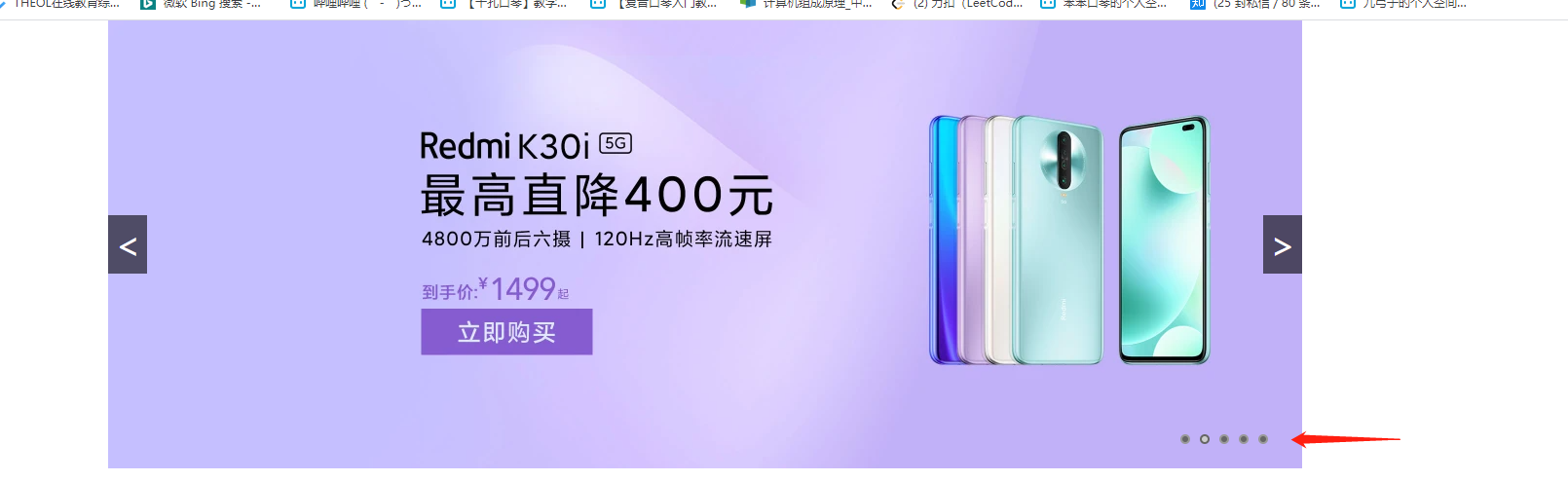
升级样式 增加下标
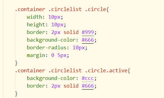
原理同上,设置css样式,用flex模型即可,这里提下!
1
2
3
4
5
*{ padding: 0; margin: 0; box-sizing: border-box; }
box-sizing: border-box
如果你创造了一个
没有设置 box-sizing 属性为 border-box(不设置的话默认值为 content-box.),同时你设置 width:100px; border:10px solid red; padding:10px; 那么最终 div 容器的实际宽度为:
1 100px(width)+2*10px*(padding)+2*10px(border)=140px
所以你会得到一个比你预期(100px)还要更大的容器,结果就是会破坏网页布局。
注意 :容易 margin 的尺寸不会被计算入最终容器宽度,因为对他的定义为对这个容器的留白,但不属于容器本身。
如果当我们定义一个容器的 box-sizing 属性为 border-box 时(表达式:br{box-sizing:border-box} ),那么我们创建一个和上段中相同设置的
容器时,那么他的最终宽度即为 100px, 那么它的内容部分(content)的有效宽度变成了 100px-2*10px-2*10px =60px; 所以你会得到一个你预期大小的盒子容器,但是只是被压缩了内容部分尺寸而已,但是对于整体布局而言益处颇多。
所以要合理利用好这个属性,这个属性十分重要。
菜鸟原文链接
1
2
3
4
5
6
7
8
9
10
11
12
13
14
15
16
17
18
19
20
21
22
23
24
25
26
27
28
29
30
31
32
33
34
35
36
37
38
39
40
41
42
43
44
45
46
47
48
49
50
51
52
53
54
55
56
57
58
59
60
61
62
63
64
65
66
67
68
69
70
71
72
73
74
75
76
77
78
79
80
81
82
83
84
85
86
87
88
89
90
91
92
93
94
95
96
97
98
99
100
101
102
103
104
105
106
107
108
109
110
111
112
113
114
115
116
117
118
119
120
121
122
123
124
125
126
127
128
129
130
131
132
133
134
135
136
137
138
139
140
141
142
143
144
145
146
147
148
149
150
151
152
153
154
155
156
157
158
159
160
161
162
<!DOCTYPE html> <html> <head> <meta charset="utf-8"> <title></title> <style type="text/css"> * { padding: 0; margin: 0; box-sizing: border-box; } .imglist img { width: 1226px; height: 460px; position: absolute; opacity: 0; transition: all 0.5s; } .imglist .active { opacity: 1; } .container { width: 1226px; height: 460px; margin: 0 auto; position: relative; } .pre { width: 40px; height: 60px; line-height: 60px; text-align: center; background-color: rgba(0, 0, 0, 0.6); color: #fff; position: absolute; font-size: 36px; /* 上下居中 */ top: calc(50% - 30px); } .next { width: 40px; height: 60px; line-height: 60px; text-align: center; background-color: rgba(0, 0, 0, 0.6); color: #fff; position: absolute; font-size: 36px; /* 上下居中 */ top: calc(50% - 30px); right: 0; } .container .circlelist { width: 100%; height: 60px; display: flex; justify-content: flex-end; align-items: center; position: absolute; left: 0; bottom: 0; padding: 0 30px; } .container .circlelist .circle { width: 10px; height: 10px; border: 2px solid #999; background-color: #666; border-radius: 10px; margin: 0 5px; } .container .circlelist .circle.active { background-color: #ccc; border: 2px solid #666; } </style> </head> <body> <div class="container"> <div class="imglist"> <img src="img/img1.jpg" alt="" class="active"> <img src="img/img2.jpg" alt=""> <img src="img/img3.jpg" alt=""> <img src="img/img4.jpg" alt=""> <img src="img/img5.jpg" alt=""> </div> <div class="btnlist"> <div class="pre"> < </div> <div class="next"> > </div> </div> <div class="circlelist"> <div id="c0" class="circle active"></div> <div id="c1" class="circle"></div> <div id="c2" class="circle"></div> <div id="c3" class="circle"></div> <div id="c4" class="circle"></div> </div> </div> </body> <script type="text/javascript"> var pre = document.querySelector(".pre"); var next = document.querySelector(".next"); var imgs = document.querySelectorAll("img"); var circlelists = document.querySelectorAll(".circle"); var index = 0; next.onclick = function() { index++; if (index >= imgs.length) { index = 0; } resnum(); } pre.onclick = function() { index-- if (index < 0) { index = imgs.length - 1 } resnum(); } //封装 function resnum() { imgs.forEach(function(item, i) { item.classList.remove("active"); }); imgs[index].classList.add("active"); circlelists.forEach(function(item, i) { item.classList.remove("active"); }); circlelists[index].classList.add("active"); circlelists.forEach(function(item, i) { item.onclick = function() { //字符串和数组一样,索引值拿东西 num = item.id[1]; index = num; resnum(); } }); } </script> </html>